Monitoring
The CMS has five monitoring screens, and they are not variations of the same thing. Each answers a different question, and knowing which one to open first saves most of the time in a diagnosis:
| Screen | Answers |
|---|---|
| Applications Panel | Who is up? |
| Interfaces Panel | What is piling up? |
| Messages Monitor | How fast is each interface running? |
| Real-time monitor | What is happening in this interface right now? |
| Cockpit | Is everything fine? — seen from across the room, on a TV, with nobody signed in |
The natural path is top to bottom: the Applications Panel shows the application went down, the Interfaces Panel shows which of its interfaces piled up, and the real-time monitor shows the messages one by one.
Every screen on this page respects the Application in focus picked in the header and the user’s allowed Interfaces. Two people looking at the same screen may legitimately see different sets of rows.
Where the refresh rate comes from. Each screen has its own cadence — 5 seconds on the dashboards, 1 second on the live monitor, 15 in the footer — but a single clock, shared by the whole app, is what counts the time. That is why two views of the same number (the footer total and the Interface Dashboard columns, say) refresh at the same instant, instead of drifting apart for a few seconds because each screen started counting when it mounted.
On every cycle the CMS first asks whether anything changed and only fetches the data if the answer is yes: on an idle installation the cycle costs nothing. Even with everything quiet the screen still refreshes on its own at least every 30 seconds (60 in the footer), as a safety net for the changes that question cannot see. And a background tab spends no request at all: coming back to it fetches the data right away.
Before opening any of them: the header
The Applications counter sits in the top bar, on every screen, and says how many out of how
many are up — 24/30, not 24 ON. The bare number did not answer the question it appears to
answer: with the offline counter hidden when it is zero, there was no way to tell 24 out of 24 from
24 out of 30 by looking.
The dot next to it only turns green when it is true that everything is up; with any Application down it goes grey, so no “all clear” signal sits beside a red alarm. Offline is the only one of the two that comes filled in and pulsing — the fill belongs to whoever needs action. Clicking either one opens the list of which ones.
Applications Panel — /application-dashboard
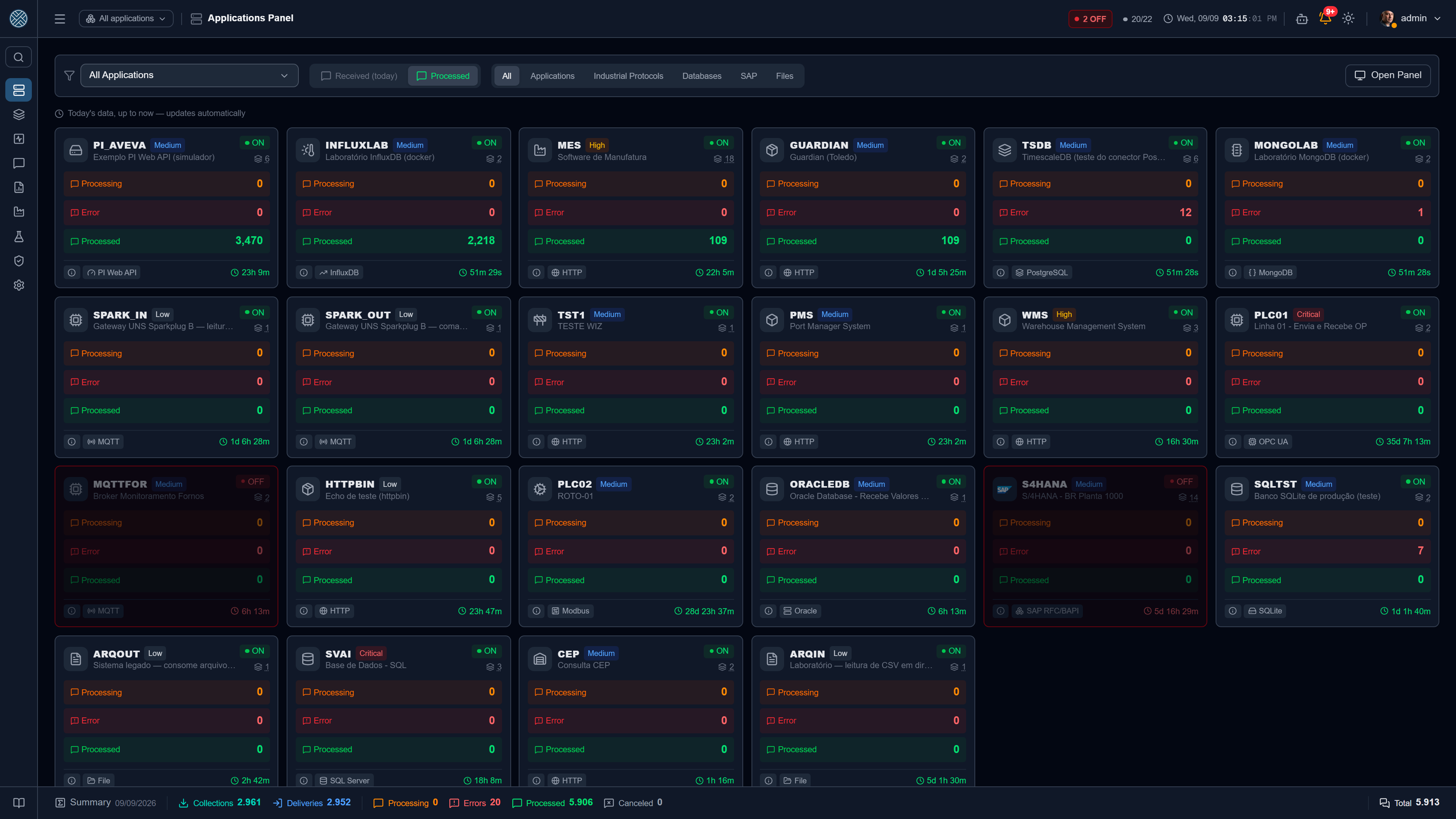
One card per integrated application, refreshed every 5 seconds. It is the closest thing to a traffic light: it separates “the CMS stopped” from “the system on the other side stopped”.
What each card shows
| Element | Meaning |
|---|---|
| ON / OFF | Result of the application’s last keep-alive |
| Queued | Messages from this application not yet delivered |
| Error | Messages in delivery, collection or business error |
| Processed | Successfully delivered today |
| Received (today) | Everything that came in today (optional column) |
| Uptime / offline time | How long the current state has lasted |
| Interfaces | How many interfaces the application has — click to list them |
| Priority | Tag set on the Application, to order what you look at first |
The first three numbers are clickable: they open the screen that details that number with the application already in focus — “Queued” opens the Interfaces Panel, “Error” opens Messages with Error, “Processed” opens Processed Messages. When the user lacks the Tool for the target screen, the number stays a number instead of becoming a link into a blocked screen.
The target screen opens on Today, by return date and with real traffic only — the same count as the card. So a message received yesterday that failed today shows up in the list “Error” opened, instead of counting on the card and vanishing from the list.
The Details button opens the application sheet: keep-alive type, linked external connection, last activity, the failure reason when it is offline, and the notes registered on the Application (copyable with one click — they work as on-call notes).
Three ways to see the same list
- Grid — cards, the default.
- List — a table, better when there are many applications and you want to sort by column.
- Category — the same cards grouped by connection family (HTTP, databases, shop floor, SAP, messaging). Useful to answer “is the problem only on the shop floor?”.
Above the list there is also a shortcut of category pills, showing only the categories with at least one application.
When a monitored application goes down, the frontend plays a sound alert and blinks the tab title — even with the operator on another browser tab. The card turns red and pulses.
Interfaces Panel — /dashboard
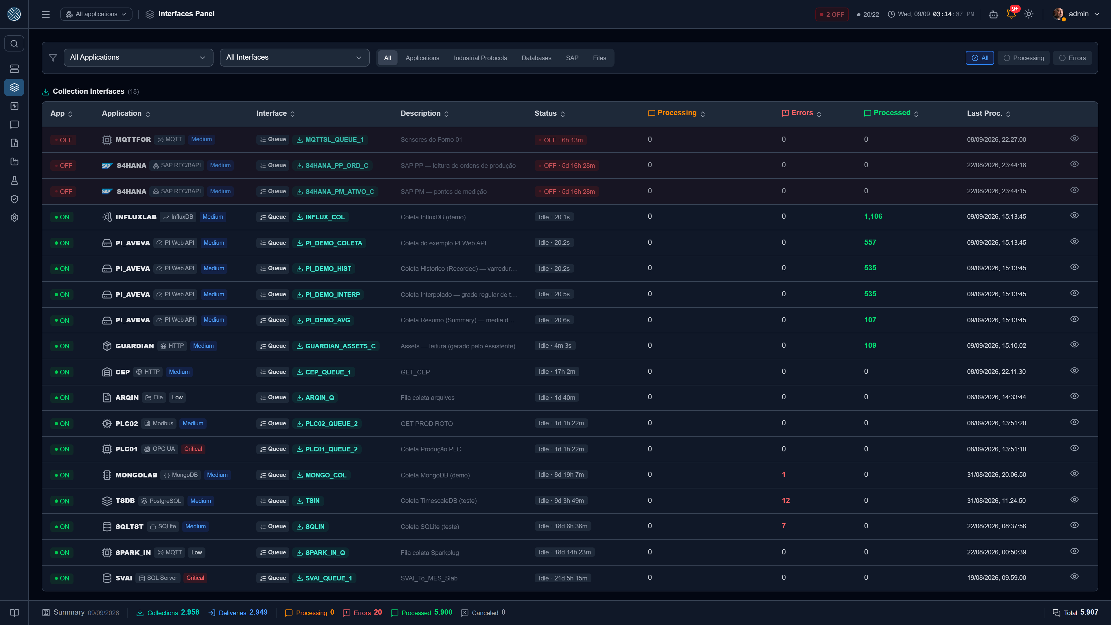
The list of interfaces with traffic, refreshed every 5 seconds, split in two sections: Collection Interfaces (the CMS fetches) and Delivery Interfaces (the CMS sends). Only interfaces with at least one active Definition show up — an interface with no active definition will not process anything and would only take space.
The Status column, in order of urgency
A row takes one status, following this precedence — and the same rule drives the table ordering, so whatever needs attention rises on its own:
| Priority | Status | Means |
|---|---|---|
| 1 | Blocked | The interface was blocked (manually or by a business error). Nothing leaves until released |
| 2 | OFF | The owning application is offline — with the elapsed time next to it |
| 3 | Scheduler Paused | This interface’s job is inactive in Schedulers. Nothing will be processed |
| 4 | Processing | Messages in flight; the tooltip breaks it down (waiting / queued / delivering) |
| 5 | Idle | No pending work, with the time since the last processing |
Blocked, OFF and Scheduler Paused paint the whole row and blink. A processing interface tints softly in blue (Delivery) or teal (Collection).
Columns
Besides status: Queued (pending), Errors, Processed, Last Proc. and an order badge — sequential (one at a time, in order) or parallel (several at once).
The three counters carry in the header the same icon and color the footer uses for the system-wide total — the same ones on the Applications Panel cards: orange for processing, red for errors, green for processed. It is the same number in three slices (per interface, per application and the total), not three different counts.
The details popup
The eye icon in the last column opens the full interface sheet: application, processing order, status with elapsed time, the error returned by the keep-alive when the application is offline, counters and — when there is a queue — the Estimated Completion.
The estimate is optimistic by construction: queued messages × today’s average processing time. It does not account for new messages arriving, retries or a stopped interface. It answers “minutes or hours?”, not a promised time.
The same popup carries the Monitor in real time button, which opens the interface monitor.
Filters
Application and Interface (multi-select), connection category pills and, on the right, three scope chips: All, Queued and Errors. The last two are cumulative, and the screen opens with both selected — which is the view of somebody arriving for a shift: what is stuck and what failed. All clears the scope and shows the full picture.
Which is why, in a plant with no backlog and no errors, the normal sight is the coffee cup and “No messages pending delivery!”.
The Interface filter and the category are remembered between visits (per browser session); the Application comes from the global scope in the header.
Messages Monitor — /interface-monitor
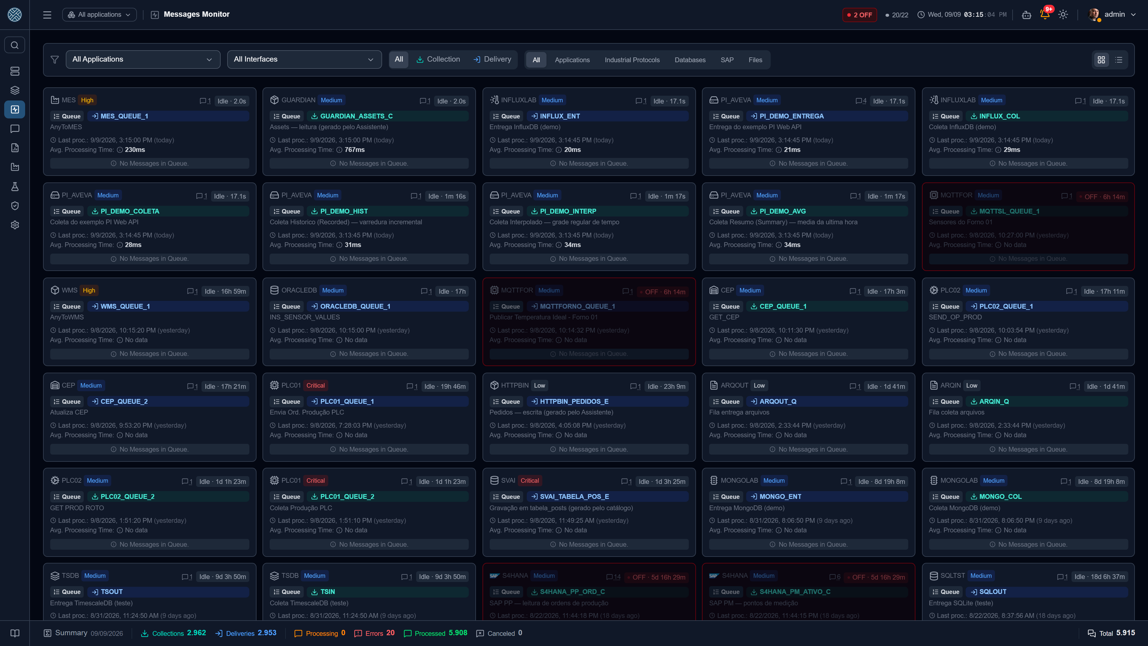
Where the Interfaces Panel is a backlog table, this screen is a pace board: one card per interface, refreshed every 5 seconds, showing last processing, average processing time and how much is in flight.
It answers “is this interface slow?” — which the queue count alone cannot.
| Feature | Use |
|---|---|
| Grid / List | Cards to watch, table to sort |
| Collection / Delivery filter | Narrows by interface type |
| Category pills | The same connection taxonomy as the other screens |
| Search | Filters by interface code |
| Definitions icon | Opens that interface’s Definitions without leaving the screen |
The average time is the average delivery time of messages completed successfully today. It does not include the time the message waited in the queue before being sent — it is the cost of the destination, not of the wait.
An interface piling up messages with no errors usually means blocking, a paused scheduler or a slow destination — not lost messages. Check the status before investigating the destination.
Real-time monitor — /dashboard/:id/monitor
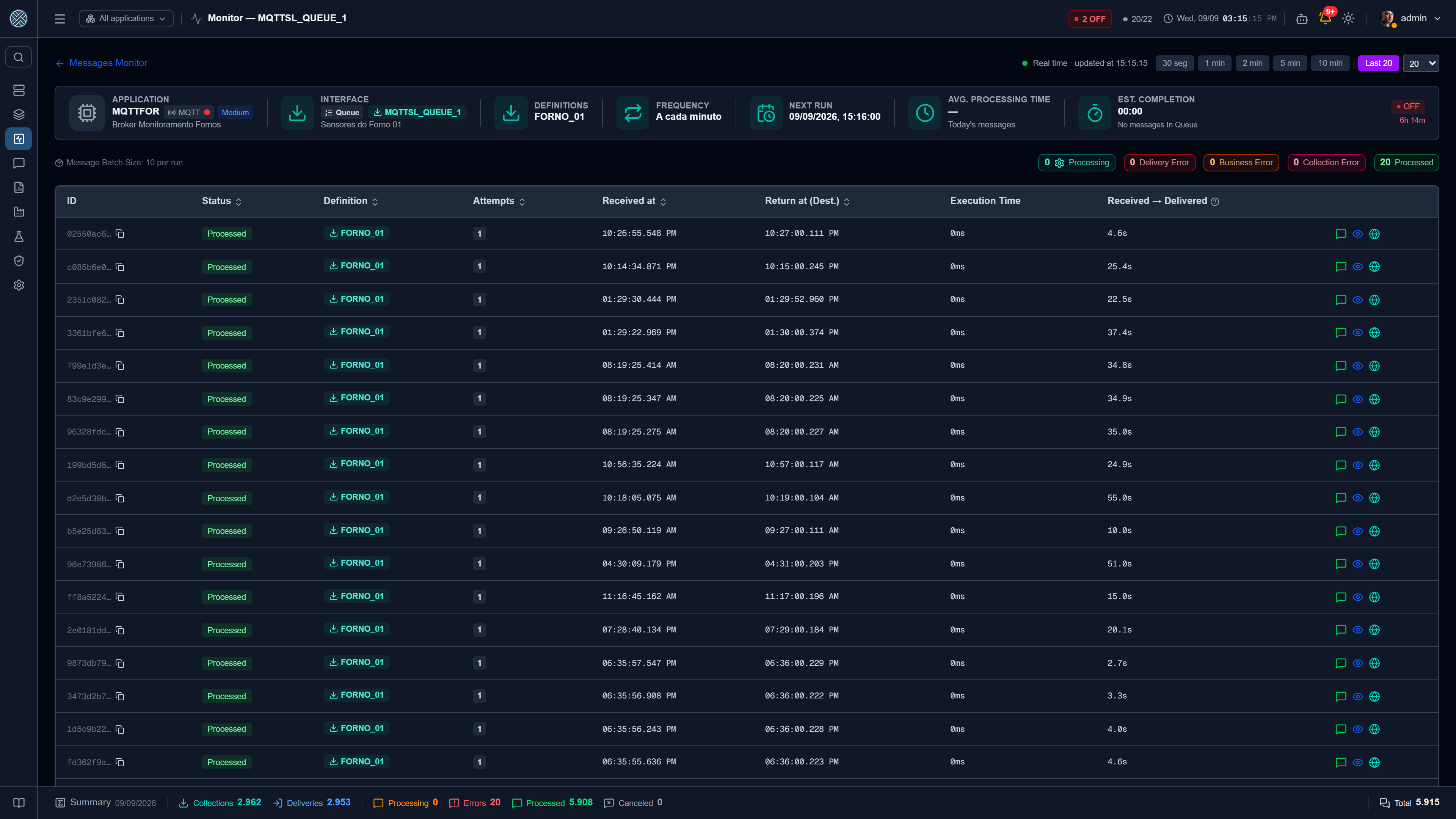
The finest level: the messages of one interface, refreshed every 1 second. You get here from the Interfaces Panel or from the Messages Monitor — and the back link respects where you came from.
Header
Application, interface, blocking state, schedule frequency in plain words (“every 5 minutes”, “every day at 2 AM”) and the next run.
For interfaces scheduled by interval, the next run is an estimate anchored on the last known run — ticks with no work write nothing. For cron, it is the exact time computed from the expression.
Time window
Chips for 30 sec / 1 min / 2 min / 5 min / 10 min / 1 hour, plus the Last N mode, which ignores period and day and shows the last messages received by the interface — designed for interfaces that go days without traffic, where any relative window would come out empty.
Counters and list
A band of counters by status (Queued, Delivery Error, Business Error, Collection Error, Processed) and, below it, the list with ID, status, Definition, attempts, receipt time, destination response time, execution time and total time inside the messaging layer.
The origin icon distinguishes an external message (came in through the API, with the sender’s IP) from an internal message (forwarded from another message, with the source ID). Clicking any row opens the full detail, with payload and attempt history.
A Test Bench message shows up in the list with the amber flask next to the status. The counters at the top do not count it, so the list may have more rows than their sum — the flask is what explains the gap.
When the interface has more than one Definition, a filter isolates one of them. And if the interface has no Definition at all, the screen says so explicitly — the quietest cause of “nothing arrives”.
Cockpit — /cockpit
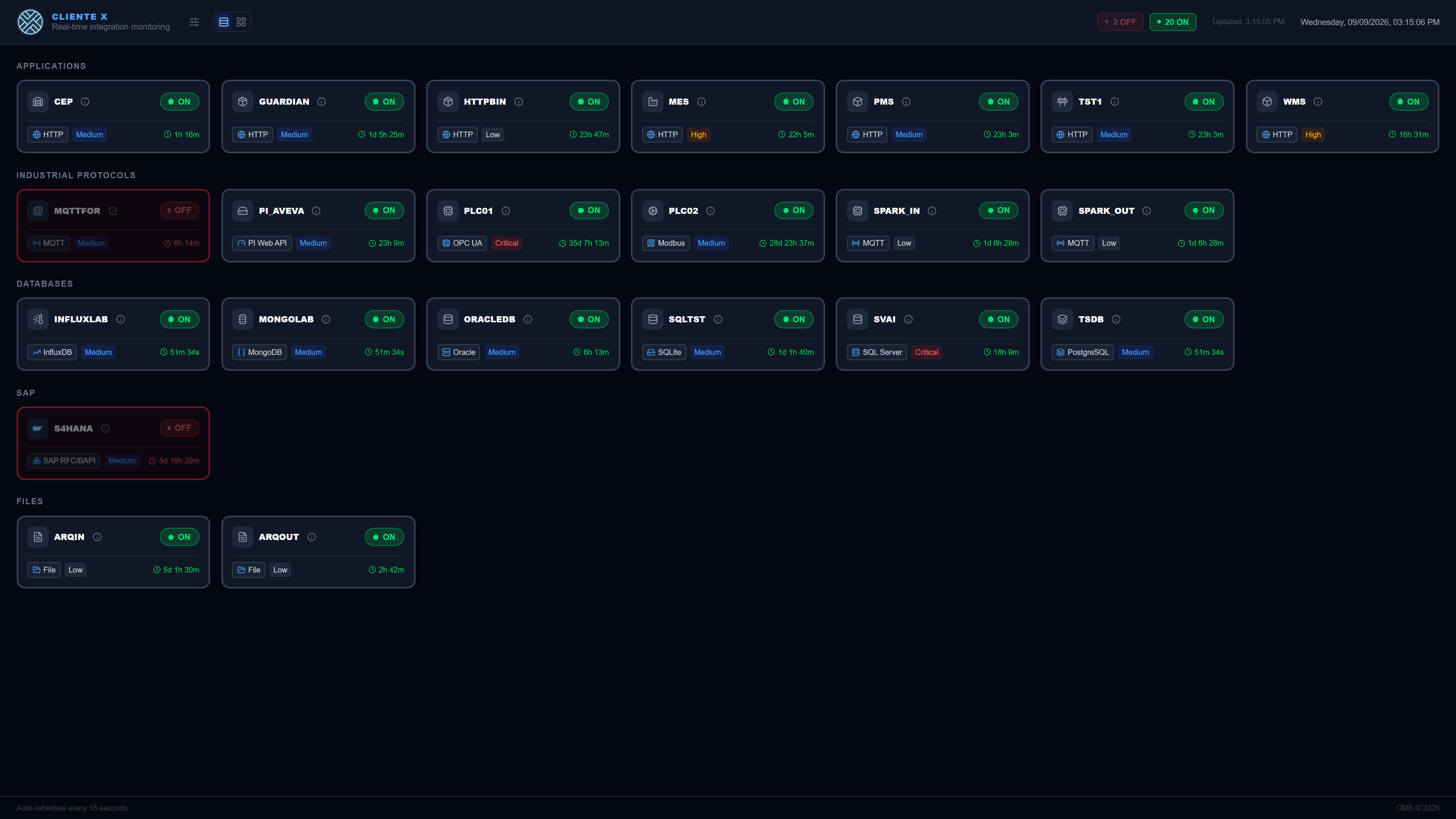
A wallboard meant for a TV or shop floor panel. It shows the consolidated status of the applications in large type, refreshing every 15 seconds. It shows aggregated status only — never message payload. Each card carries code, priority, ON/OFF, time in the current state and an info button with the notes registered on the Application.
An offline application turns the card red and pulsing, and the tab title blinks, to draw attention even with the browser minimised.
What went down
A red card says the Application is down; the first question of whoever is on call, though, is what went down — the MQTT broker, the database, the SAP server? So the connection type shows up in the card footer, to the left of the priority: on a red TV it is what you read first, and the priority answers the next question.
Clicking it opens that External Connection’s card — name, address and configuration — with the 30-day availability strip in the same shape as on the other screens. It is the same card used in the Collection and Delivery popups: two screens describing the same connection with different fields would be worse than not having the popup here.
Who can open it
Until August 2026 this was the only anonymous screen in the product: anyone who reached the address saw the code of every integrated Application, the status of each one, today’s message volume and the last activity. The product decision still stands — a factory TV has nobody signed in — but “no login” now means with a token, not with no credential at all.
There are two paths, and the answer is scoped in each one:
| Path | What the TV shows |
|---|---|
| User session | Anyone already signed in opens /cockpit directly, with no token, and sees the Applications they see everywhere else — the ones behind their own Interfaces |
| Wallboard token | The TV opens with no login, and shows the Applications on that token. With no scope set, all of them |
Neither one: the screen asks for the token, with a box to paste it into. It tells there was never a token in this browser apart from the stored token was refused (revoked or expired) — that second message is what keeps people from hunting for a fault in the TV when the problem is the token.
Tokens are created in Settings → Wallboard, which also hands over the URL ready to paste into the TV browser.
Scoping by session fixed, in passing, an asymmetry nobody had noticed: the Cockpit showed every Application even to a user restricted to a single Interface. It was the only screen in the product with no scoping.
Choosing what shows up
The Choose displayed applications button filters the panel. The choice applies only to that browser (it lives in local storage), which lets one TV in shipping show one slice and another in maintenance show a different one, from the same installation.
What gets stored is the list of hidden applications, not the visible ones. That way an Application created later shows up on its own: a monitoring panel must fail by showing too much, never too little.
The Cockpit also respects the name and logo set in Settings → Appearance, and the system language.